Advanced Feature Dashboard
Latency Differ and Drop Differ Dashboard
The DANZ Monitoring Fabric (DMF) Latency Differ Dashboard and Drop Differ Dashboard feature provides a near real-time visual representation of latency and drops in the DMF Analytics Node (AN) dedicated to NetFlow Records.
For a given flow, it reports the latency and drop of packets over time between two existing tap points (A, B), with network flows traversing the managed network from A towards B.
This feature introduces the concept of DiffPair, defined as a flow from A towards B.
The Dashboards provide clear, concise information about the flows. The data helps determine which applications are running slow and identifies peak times. A configurable mechanism alerts on abnormal drops and latency.
Introducing DiffPair
When identifying the flows between two tap points or filter interfaces, the aggregation occurs as A towards B pairs. It implies that a flow originating from point A will be received at point B. The term DiffPair is employed to visualize this flow as a cohesive set. This newly introduced field in the flow data selects the ingress and egress tap points encompassing a flow in between. The utilization of this DiffPair facilitates tap point filtering and comparison.
Latency Differ Dashboard
Locate the Latency Differ dashboard by searching for the term Latency Differ.

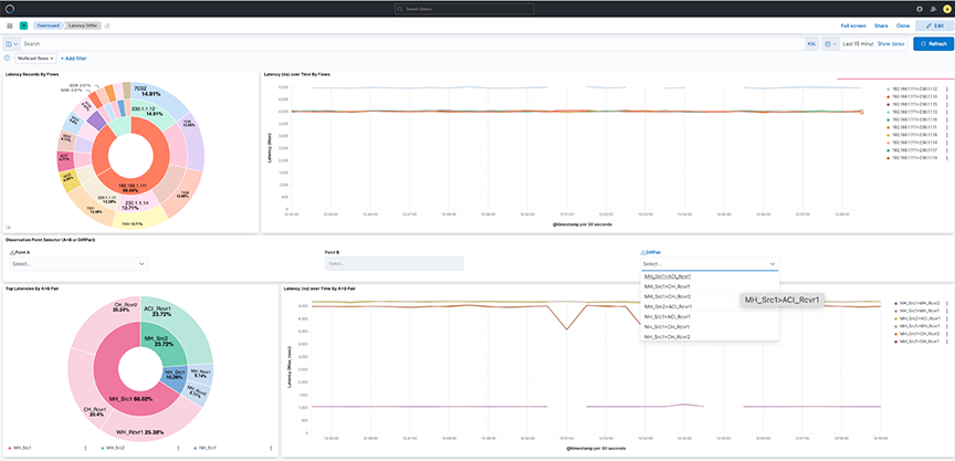
- Latency Records By Flows: The pie chart represents the proportions of flow latency summed. The inner circle displays source IP addresses, the middle circle displays destination IP addresses, and the outermost circle displays destination ports.
- Latency over time By Flows: The line chart represents the maximum Latency in nanoseconds (ns) over time, split by each flow between source IP and destination IP addresses.
- Observation Point Selector ( or DiffPair): Use the drop-down menus to filter by pair or DiffPair. The point B selector is dependent on point A.
- Top Latencies By Pair: The pie chart shows the Latency max summed by Points. The inner circle displays the source A tap point, while the outer circle displays the B destination tap point.
- Latency over time By Pair: The line chart represents maximum Latency in nanoseconds (ns) over time, split by each pair between the source tap point and destination tap point.
Figure 2. Latency Record by Flows 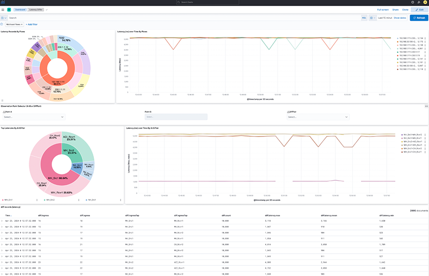
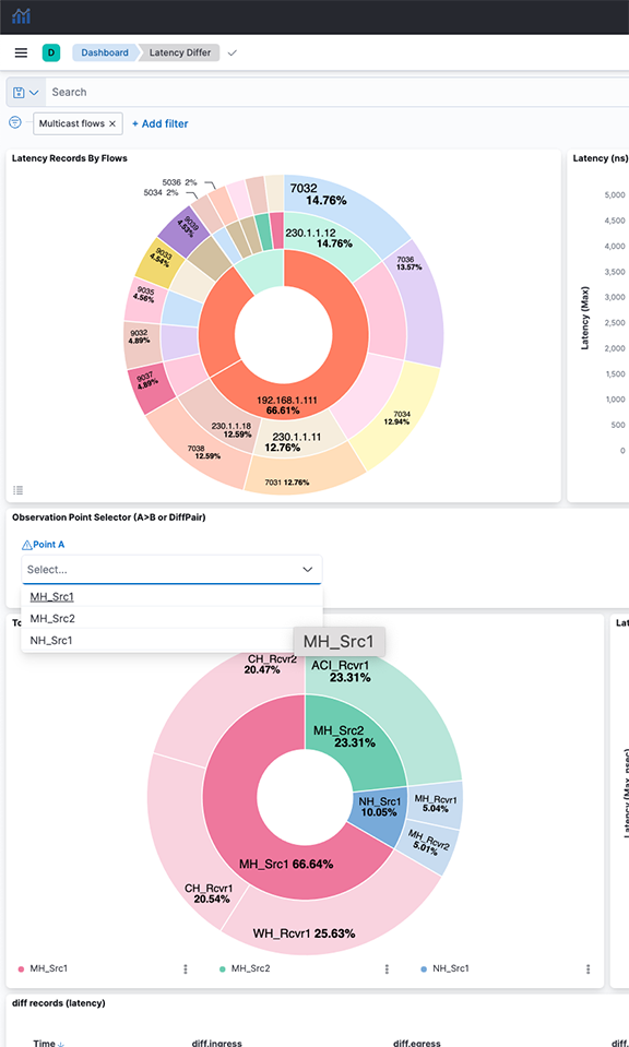
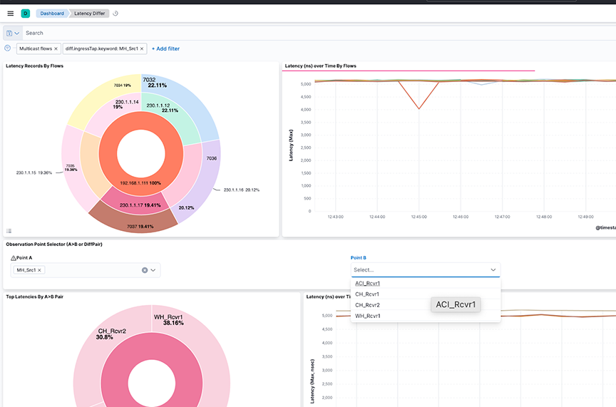
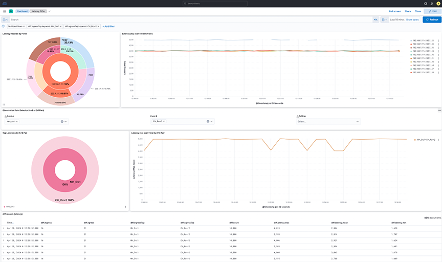
Select individual data points in the visualization for further analysis.

Drop Differ Dashboard
Locate the Drop Differ dashboard by searching for the term Drop Differ.

- Drop Records By Flows: The pie chart represents the proportions of drop packets for each flow summed. The inner circle displays source IP addresses, the middle circle displays destination IP addresses, and the outermost circle displays destination ports.
- Max Drops By Flows: The line chart represents the maximum number of drop packets, separated by each flow between source IP and destination IP addresses. If fewer data points exist, the chart displays them as individual points instead of complete lines.
- Observation Point Selector (A>B or DiffPair): Use the drop-down menus to filter by pair or DiffPair. The point B selector is dependent on point A.
- Top Drop A>B: The heat map displays the drop of packets summed by Points. The map plots the source tap point, A on the vertical axis and the destination tap point, B, on the horizontal axis.
- Top Dropping A>B Pairs: The bar chart represents the sum of drop packets over time, separated by each pair between the source tap point and the destination tap point. It shows the Top 10 available dropping pairs .
Figure 9. Top Dropping A>B Pairs 
Select selection or DiffPair to visualize the data types.

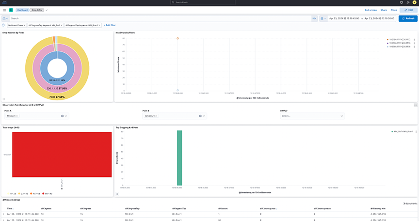
- This provides a dashboard for packet drops between points A and B(s), either split by flows in between those points (Top) or filtered by pairs (bottom) as selected. View the diff records at the bottom of the dashboard.
- Select individual data points in the visualization for further analysis.
- Selecting DiffPairs can provide a similar visualization perspective. Choose one or more DiffPairs for analysis.
Figure 12. DiffPair Analysis for Drop Differ 
Configuring Watcher Alerts
Watcher is an elastic search feature that supports the creation of alerts based on conditions triggered at set intervals. For more information, refer to: Watcher | Kibana Guide [7.17] | Elastic
- Arista_NetOps_Drop_Differ_Watch
- arista_NetOps_Latency_Differ_Watch
The templates are disabled by default and require manual configuration before use.
- Navigate to .
- Under Configuration for the SMTPForAlerts Connector, specify the Senderand Service field values.
- Sending email alerts may require authentication based on the type of mail service selected.
- Test and validate the settings using the Test tab.
Figure 13. Testing SMTP Connector 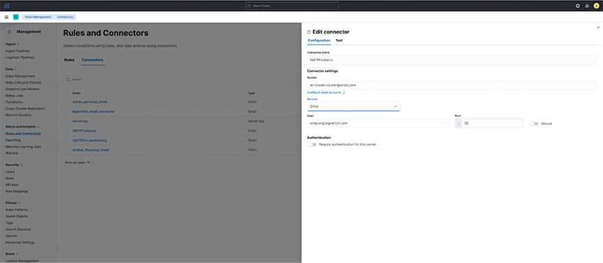
- arista_NetOps_Drop_Differ_Watch:
- The watcher is configured to send an alert when the maximum drop count of packets in NetFlow in the last 5-minute interval exceeds the historical average (last 7-day average) of drop of packets by a threshold percentage.
- This watcher is configured by default to be triggered every 10 minutes.
- As this may be incorrect for all flows combined, configure it for a particular Flow and Destination Port.
- Search for CHANGE_ME in the watcher and specify the flow and destination port value (introduced to correctly compare each flow and destination port individually instead of comparing all flows together).
- Specify the percentage_increase parameter in the condition using a positive value between 0-100.
- Enter the recipient's email address receiving the alert.
- Select Save watch.
Figure 14. NetOps_Drop_Differ_Watch-1 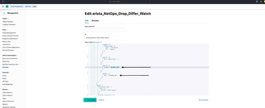
Figure 15. NetOps_Drop_Differ_Watch-2 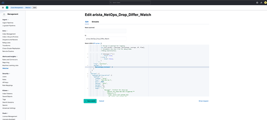
Figure 16. Editing NetOps_Drop_Differ_Watch 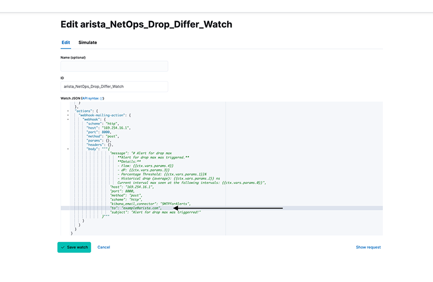
- arista_NetOps_Latency_Differ_Watch:
- The watcher is configured to send an alert when NetFlow's maximum latency (or lag) in the last 5-minute interval exceeds the historical average (last 7-day average) latency by a threshold percentage.
- This watcher is configured by default to be triggered every 10 minutes.
- As this may be incorrect for all flows combined, configure it for a particular Flow and Destination Port.
- Search for CHANGE_ME in the watcher and specify the flow and destination port value (introduced to correctly compare each flow and destination port individually instead of comparing all flows together).
- Specify the percentage_increase parameter in the condition using a positive value between 0-100.
- Enter the recipient's email address receiving the alert.
- Select Save watch.
Considerations
- Default Watchers are disabled and must be modified with user-configured alert settings before being enabled.
Figure 17. Arista_NetOps_Drop_Differ_Watch 
Troubleshooting
- The dashboard obtains its data from the flow-netflow index. If no data is present in the dashboard, verify there is sufficient relevant data in the index.
- Watchers trigger at a set interval. To troubleshoot issues related to watchers, navigate to . Select the requisite watcher and navigate to Action statuses to determine if there is an issue with the last trigger.
Figure 18. Watcher Action Status 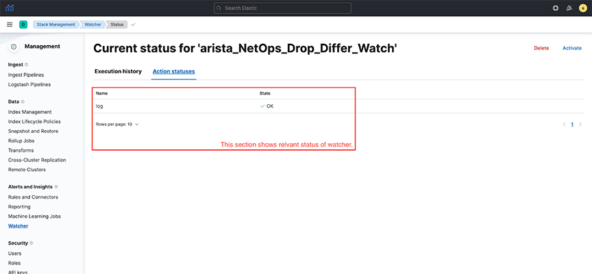
Usage Notes
- The dashboards only show partial and not full drops during a given time and are configured with filtering set to the egress.Tap value as empty.
- A full drop occurs when the flow of packets is observed at the source tap point, but no packet is observed at the destination tap point. The dashboards are configured to filter out full drop flows.
- A partial drop is a scenario in which the flow of packets is observed at the source tap point, and some, if not all, packets are observed at the destination tap point. The dashboards clearly show partial drop flows.
