Dashboards
The Dashboards application allows you to create customizable dashboards consisting of multiple metrics across various datasets in different views. You can quickly resize and drag widgets on the grid to accommodate various custom layouts views. Data gathered from devices configured for streaming telemetry data to CVP.
Dashboard Manager
Dashboards Manager is where you are presented with the list of available dashboards. This screen can be viewed in either a grid or table format.
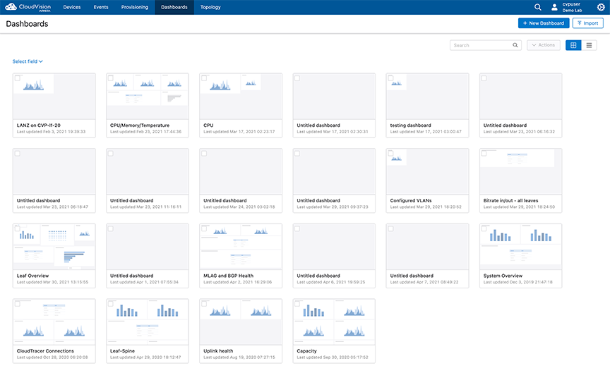
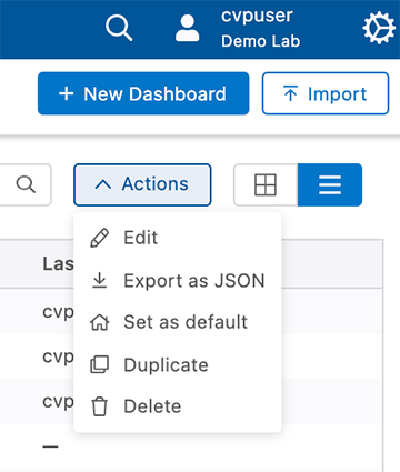
Each dashboard on the grid provides the dashboard name, description, and an approximate layout of the dashboard. To perform actions on any of the dashboards, select one or more dashboards by selecting the checkbox associated with each dashboard.
Editing and Creating Dashboards
Creating a Dashboard
Perform the following steps to create a dashboard.
- Select New Dashboard from the Dashboard Manager page.
- Select one or more widgets to display information.
Figure 3. Dashboard Widgets 
- Select the widget in the main screen to configure and label the widget.
- Enter a title and description of the new dashboard.
- Select Save Changes to save the new dashboard.
Editing a Dashboard
Perform the following steps to edit a dashboard. Dashboard widgets can be added, removed, or configured while in editing mode.
- Select a dashboard to display from the Dashboard Manager page.
- Select Edit Dashboard from the Dashboard Manager page.
Figure 4. Editing a Dashboard 
- Select a currently displayed widget in the main screen to edit or configure as needed.
- To add a new widget, select from widgets tab.
- To change the inputs, select the Inputs tab to configure as needed.
- Select the pencil icons to edit the dashboard title and description.
- Select Save Changes to save the changes.
Editing Views
-
On the right pane, hover the cursor on the required view pane.
The system displays editable options at the right end of the pane.
Figure 5. View Edit Options 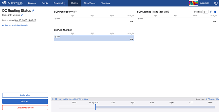 Note: To delete a view, click the appropriate trash icon and then click OK on the confirm dialog box.
 -
Click the
Edit icon.
The system displays editing options in the left pane.
Figure 6. Metrics Editing Options 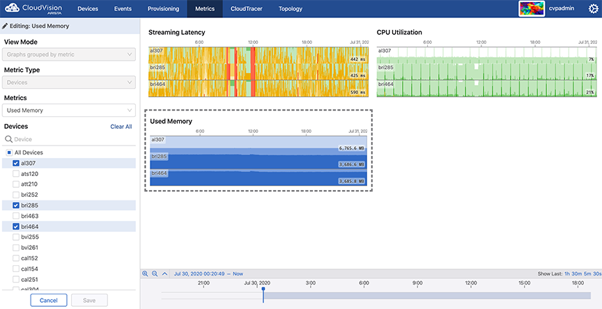
Dashboard Panel Appearance Settings
- Show Title: Select whether to display the title or not.
- Title Size: Select a size for the title of the panel.
- Show Headline Divider: Hide the separator between the panel title and the panel contents.
- Show Panel Background Color: Enable or disable the panel background color.
- Click the ellipse to the right of the dashboard title.
Figure 7. Accessing Edit Dashboard Appearance 
- Click Configure in the dashboard configuration menu.
Figure 8. Dashboard Configuration Menu 
- Select the appearance settings for your dashboard.
Figure 9. Dashboard Appearance Menu 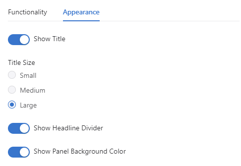
Syslog Panel
The Syslog panel is a dashboard element that allows to you view log messages for the devices both in real-time or a selected timeframe.
Creating a Syslog Panel
- Create a new dashboard or edit an existing dashboard.
- On the sidebar, select the Summaries category and select the Syslog panel .
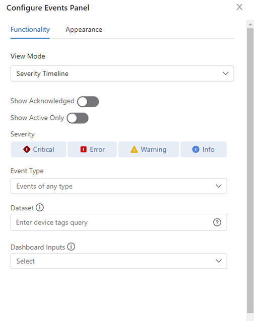
Configuring a Syslog Panel
Follow this procedure to Filter log messages by tags (Optional).A single tag filter input is associated with one tag. This can be a single device, or it could include many devices that grouped within a single tag.
Dashboards with Custom Query Language widget
The AQL panel is a dashboard element that allows you to create custom data displays using the CloudVision Advanced Query Language (AQL). This gives you complete control over what data the panel displays and how it displays it. You define the inputs and write the AQL query that feeds data to the panel. Further customization is available through creating a color mapping for the panel’s display, defining units, and decimal places among other options. You can create custom dashboards with AQL panels that are acutely relevant to your organization.
- Inputs: These are used by the AQL query to feed data to the AQL panel AQL
- Panel: This is the display item within your dashboard and which uses the AQL query and any inputs to render a display AQL
- Panel Visualization: The AQL panel has five ways to display the data fed to it (Table, Single Value, Bar Graph, Line Graph, and Donut), which each requires that the AQL query be formatted in a particular way. Each visualization can be further customized to change how it displays its data
The AQL panel is currently in beta and needs to be enabled as a setting. To enable the AQL panel, go to General Settings and turn on the toggle Beta Widgets under Features.
The Arista Support page titled Dashboards with Custom Query Language widget provides detailed configuration instructions and a tutorial about CloudVision Advanced Query Language (AQL).
Dashboard Preview
You can preview dashboards from the main dashboards screen. A windowed version of the selected dashboard can be viewed.
Preview any dashboard by accessing Dashboards and hover over the preview symbol to see a preview of a dashboard. In the preview, you can hover over relevant information to obtain details. Select any part of the preview to close the preview and load that dashboard.
Dashboard Panels
You can customize your dashboard with selectable panels as required.Each dashboard can be organized with different panels to provice the required information.
Related Topics
Events Panel
As with all other other modes, you can filter this mode,by excluding event severities, limiting the dataset, showing only acknowledged or active events, and linking to a dashboard input.
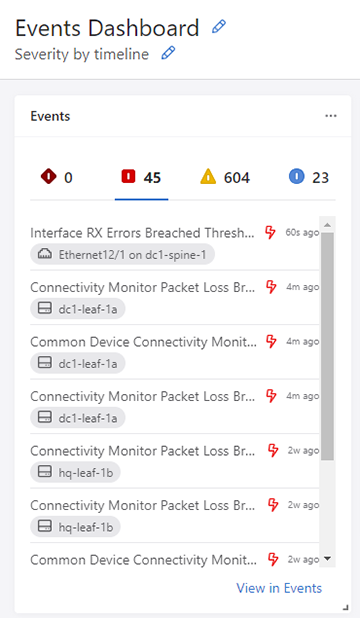
Select the ellipsis (three dots) at the top of the panel to open the Events panel configuration.
CPU Utilization Events
You will now be alerted when CPU utilization on data plane cores breaches the threshold.
Average Data Plane CPU Utilization Breached Threshold
This event pushes a notification when average CPU utilization across all data plane cores has exceeded the default 80% threshold.You may set an alternative threshold by configuring an event rule.
Data Plane CPU Utilization Breached Threshold
This event pushes a notification when CPU utilization for a single data plane core has exceeded the 80% default threshold. You may set an alternative threshold by configuring an event rule.
Confidence Check Events
You will now be alerted when CloudVision detects errors or potential errors in EVPN and VXLAN configurations.
EVPN Config Confidence Check Failed
This event raises an alert if there are any errors or potential errors with EVPN configuration. You are notified of the specific verification check that caused the confidence check failure. The EVPN config confidence check includes the following verification checks: general EVPN verification, layer 2 EVPN verification, and VXLAN encapsulation EVPN verification. All verification checks must pass to avoid an EVPN config confidence check failure.
VXLAN Config Confidence Check Failed
This event raises an alert if there are any errors or potential errors with VXLAN configuration. You are notified of the specific configuration check that caused the confidence check failure. The VXLAN config confidence check includes the following configuration checks: local VTEP configuration, remote VTEP configuration, platform configuration, CloudVision Exchange configuration, and MLAG configuration. All configuration checks must pass to avoid a VXLAN config confidence check failure.
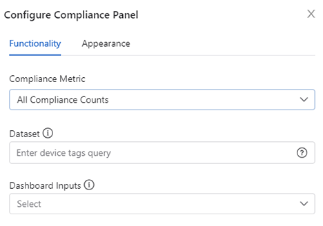
Compliance Panel
A new metric titled All Compliance Counts has been added to the Compliance panel. This metric provides a table showing the count of all compliance issues for a device.
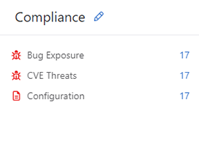
To select this metric, select All Compliance Counts under Compliance Metric.
Viewing the PTP Slave Port Interface Metric
PTP status metrics, including the PTP Slave Port Interface Metric can be viewed from the dashboard and from Devices. To view OTO status from devices refer to Viewing the PTP Slave Port Interface Metric in Devices
- Click New Dashboard to add a dashboard.
- Select Metrics in the dropdown and choose an appropriate data visualization.
Figure 13. Select Metrics 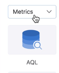
- Click on the empty panel to configure it.
- Click PTP Slave Port Interface in the dropdown to populate the dashboard
panel. The data visualizations that appears here will be the same as those
displayed in Devices.
Figure 14. Select PTP Slave Port Interface 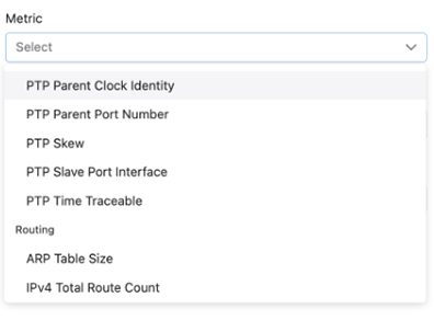
- Click Save.
Device Input Power
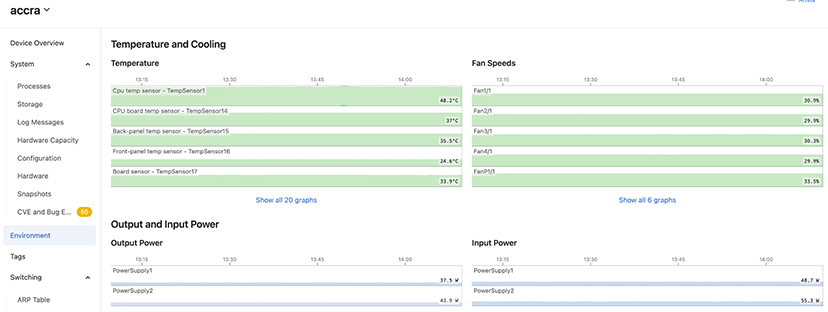
Using Dashboards, you can monitor a device by displaying graphs for temperature, power supply, and fan speed. Power Supply shows the power used at each power socket on the device.
To view the input power of a device, navigate to Devices > Inventory > (Device) > Environment.
Dashboard Layouts
Layouts provide you with additional ways to structure and control the layout of your dashboards by combining panels into a single display.
Group Layout
The Group layout helps you organize your dashboard by adding other panels to it. You can group related panels together as a single unit in the dashboard.
The size and position of a group panel are controlled in the same way as other panels.
- Select Layout from the toolbox dropdown.
- Select Group from the available options.
Figure 16. Select Group from the Layout menu 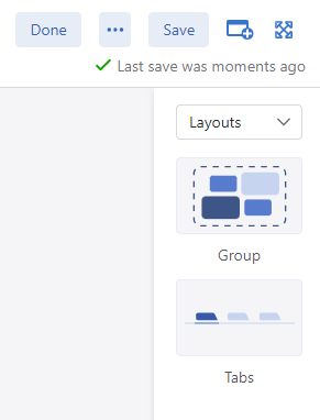
- Move existing panels to the Group Panel by clicking the ellipsis (three dots)
and selecting Move to.
Figure 17. Select Move To 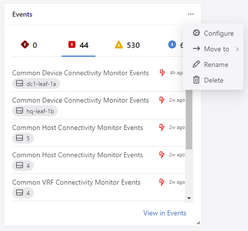
- Add new panels by dragging and dropping them into the group panel.
Tabs Layout
The Tabs layout is used to order a selection of other panels as tabs. Clicking on a tab, will display that panel. This allows you to maximize space in a dashboard and group similar panels together.
The size and position of a tab panel are controlled in the same way as other panels.
- Select Tabs from the Layouts from the toolbox.
- Move existing panels to the Tabs Panel by clicking the ellipsis and selecting
Move to.
Figure 18. Move to Tabs 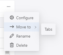
- You can rearrange the order of the tabs by configuring the tabs layout.
Figure 19. Configure Tabs 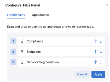
- Drag and drop the tabs to rearrange their left-to-right order.
Packaging for Dashboards
In addition to change control actions, users can now package custom dashboards, export them from one CloudVision cluster, and install them in another. Package IDs and version numbers can be used to update existing packages with version control.
All packages show the package name, version, and the number and type of components that are included. Hovering over an action icon or a dashboard icon displays the name of packaged components.
Packaging a Dashboard
For information about Packaging, refer to the Packaging TOI at https://www.arista.com/en/support/toi/cvp-2023-1-0/17503-packaging.
Once you have entered a package name, unique package ID, and a description, click Add Component and use the dropdown to select the dashboards to include in the package. Selected dashboards will appear under Contents.